Overview
Company Name
MyPro LLC
Location
Seattle, USA
Industry
Gaming
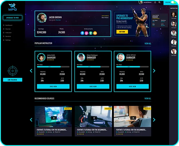
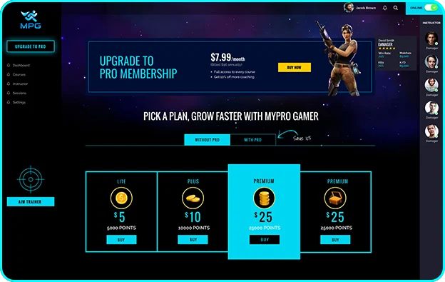
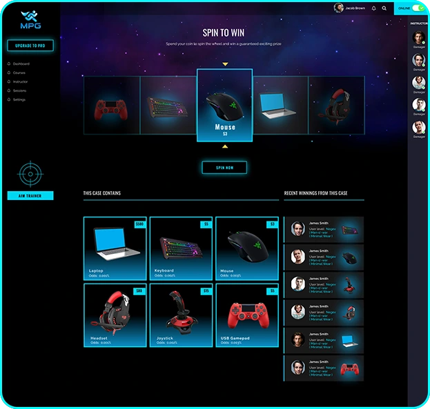
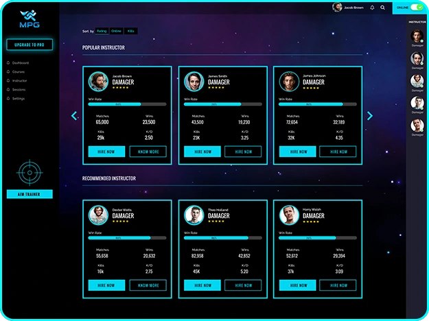
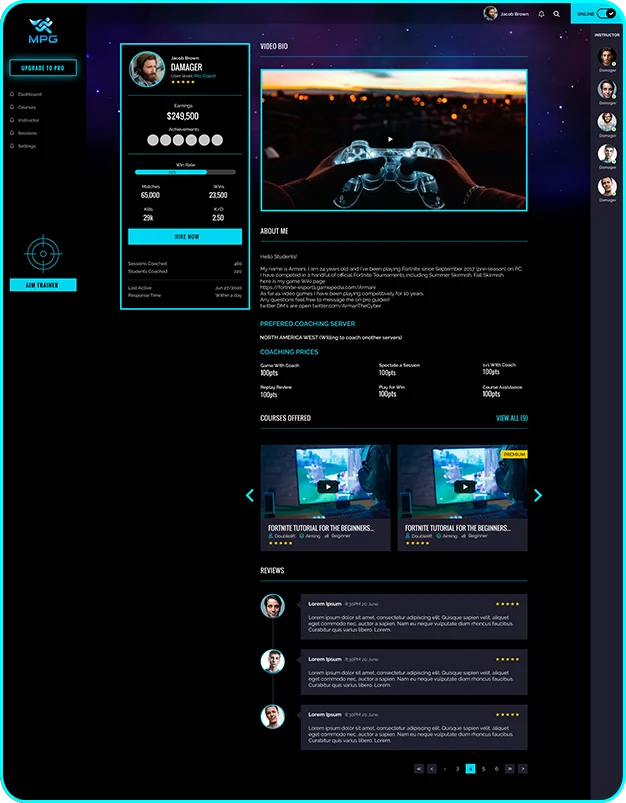
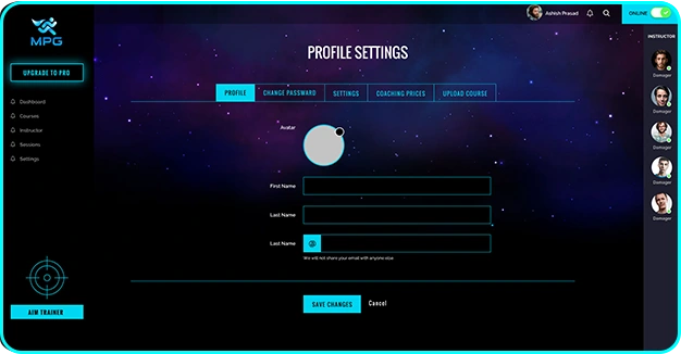
MyProGamer is an online game training platform that helps gamers across the world to get trained in Fortnite gaming by industry's leading award winning Pro players. The platform enables students to search, find and connect with right Pro Players, Book and Start a coaching session, Learn from the Courses created by leading players, spin to win exciting rewards and engage in an Aim Training game.
Considered to be one of the most promising players in the market for its highly innovative value proposition, MyProGamer had just raised funds and was willing to invest heavily in delivering the best possible experience to their users.

The Challenge
MyProGamer experience before working with us was tedious. There was no clear brand representation making it indigestible for both their customers and potential investors. They found they were limited by a lack of visual guidelines and user flow for their portal, making it very difficult to create the interface.
Strategic Collaboration
We started our process by a kick-off meeting over Zoom. There we mapped out the project scope and potential fears and gathered some knowledge about the market and the target audience. For this we used
User stories and personas
User journeys
Competitor Analysis
Brand Personas
No Tricks. Just Strategy
Align our understanding of the product through several Discovery Sessions
Fill and review strategic canvases; review and confirm them with stakeholders
Jump on developing a new visual identity from scratch along with marketing materials, and UX/UI guidelines
Deliver their visual identity, and continue to iterate on product enhancements with MPG
Our Research

Interviewed ~ 10 Pro Players

Watched Twitch Everyday

Researched gaming communities
Observations and Insights
Based on the research and interviews that we conducted we uncovered
user personas, their visual
expectations and pain points.

Personas
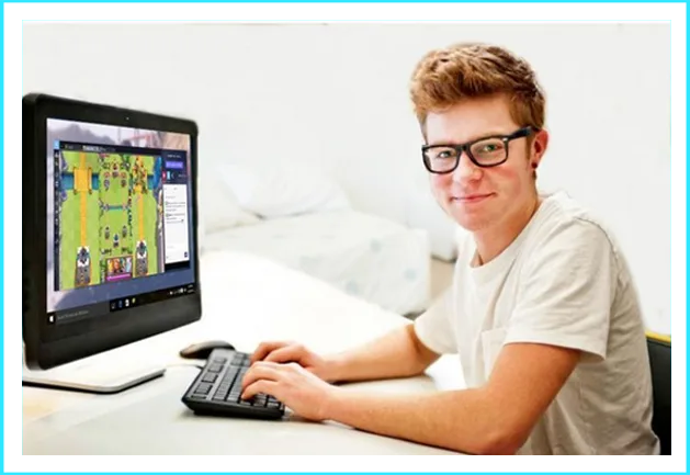
Josh
Age 21, college student
Casual Fortnite player
Spend 10 hours per week on gaming
Participates in online tournament but not successful yet
Follows Pro players on Twitch
Fan of crazy animations
Passionate about game profile stats and ranking
Likes Twitch over other gaming tools because it's simple and straightforward without technical barriers.

User Journey
Based on the research and interviews that we conducted we uncovered user personas, their visual expectations and pain points.
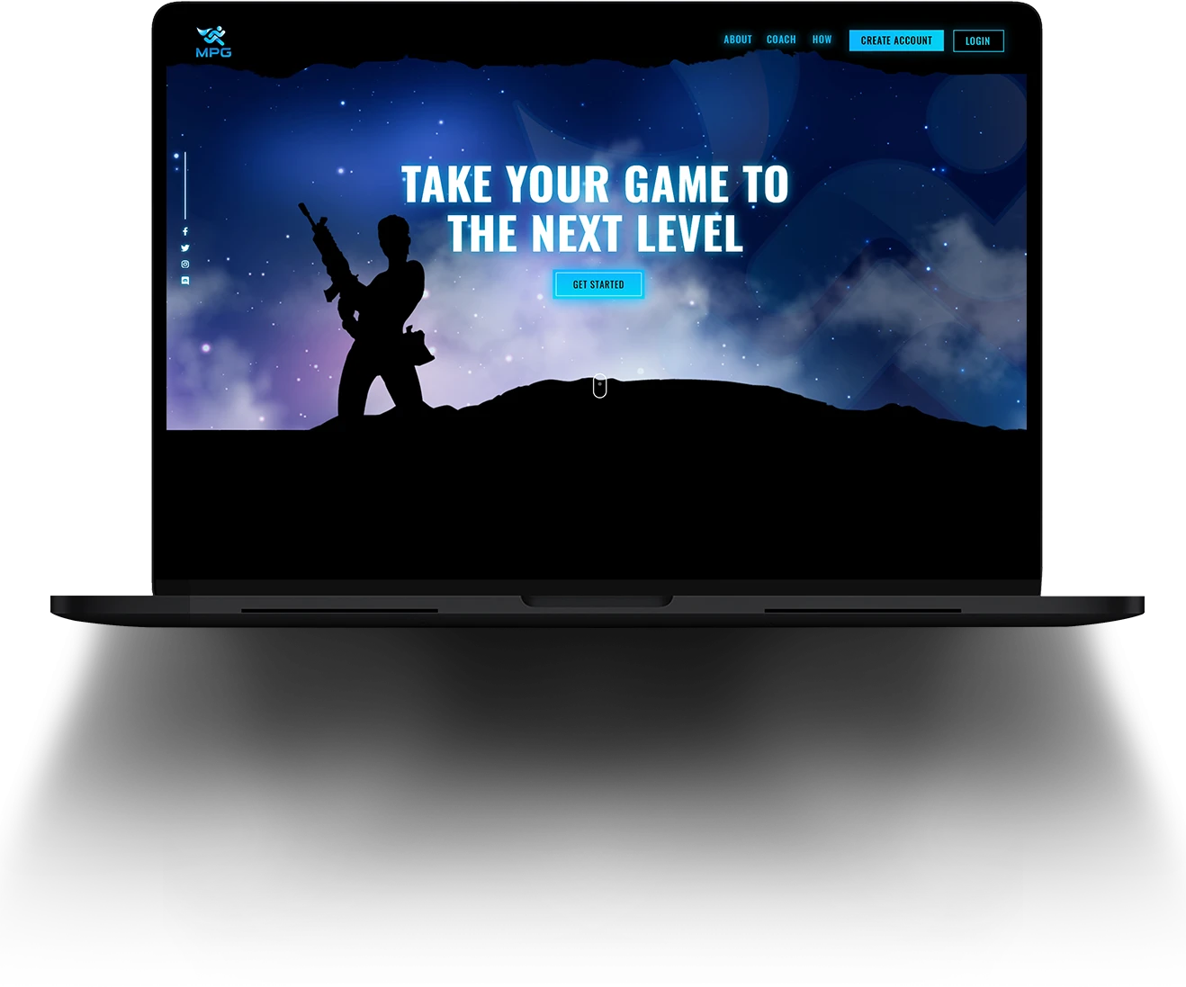
New visitors will check the landing page to understand the platform and the website’s value proposition.
Registered users will enroll to search, find and connect with Pro players in the industry
Some users will subscribe to gaming courses offered by MyProGamer
Ambitious players would book one on one gaming sessions with pro gamers
Users will check customised gaming stats and ranking in MPG platform
Pro players will provide game coaching in the platform
Coaches will respond to sessions and earn money by providing one on one coaching using MPG platform
Registered users can access an Aim training game for free
Users will spend their points to earn real gifts

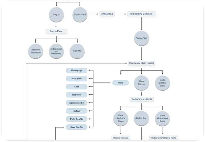
User Flowchart
Now we had a vague idea of how the platform will function. Mapping the basic flow of the platform forced us to figure each step on the path the users will take throughout the solution.
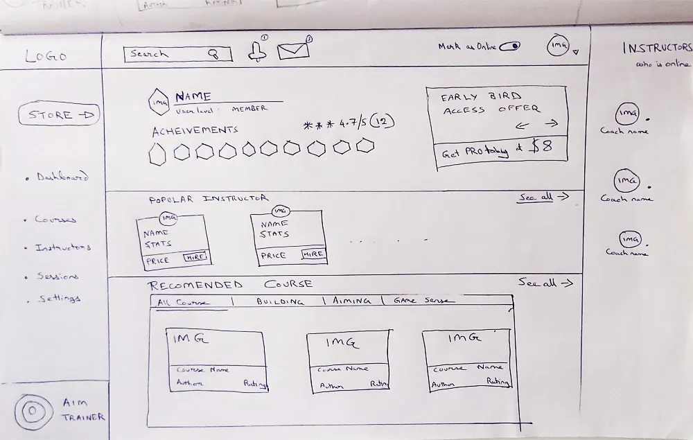
Dashboard Sketch
This was the first step to help us outline the platform’s dashboard and visually imagining it
Wireframe Design
This visual guide represents the skeletal framework of the platform.



Visual Research
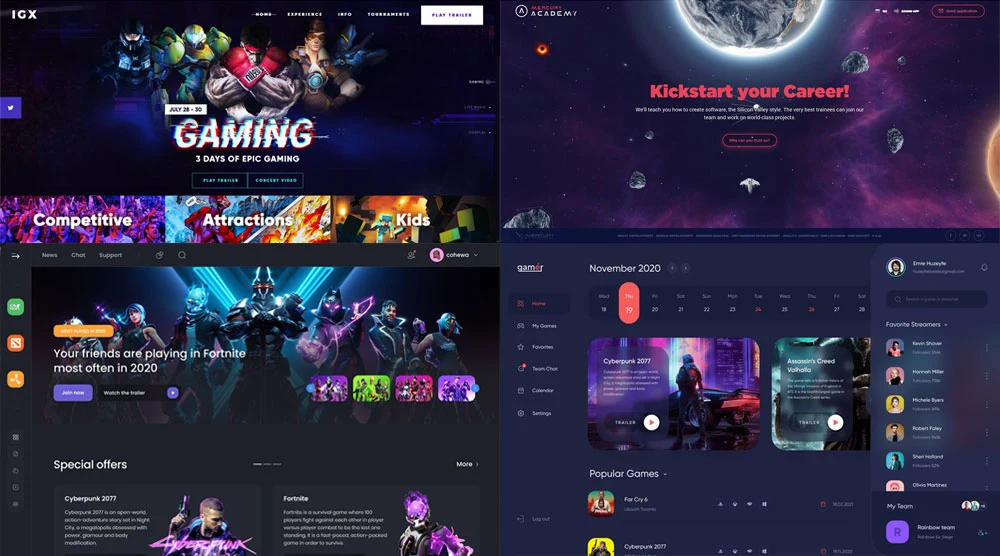
Inspiration Board
Before getting started with the visual design I create an inspiration board. The purpose was to learn about the visual world and gathering inspiration from other pet and nutrition apps.
Colors

# 0a1160

# 00d6f2

# 0db7ff
Typography
Bold
abcdefghijklmnopqrstuvwxyz
123456789
Regular
abcdefghijklmnopqrstuvwxyz
123456789
Icons and Illustrations




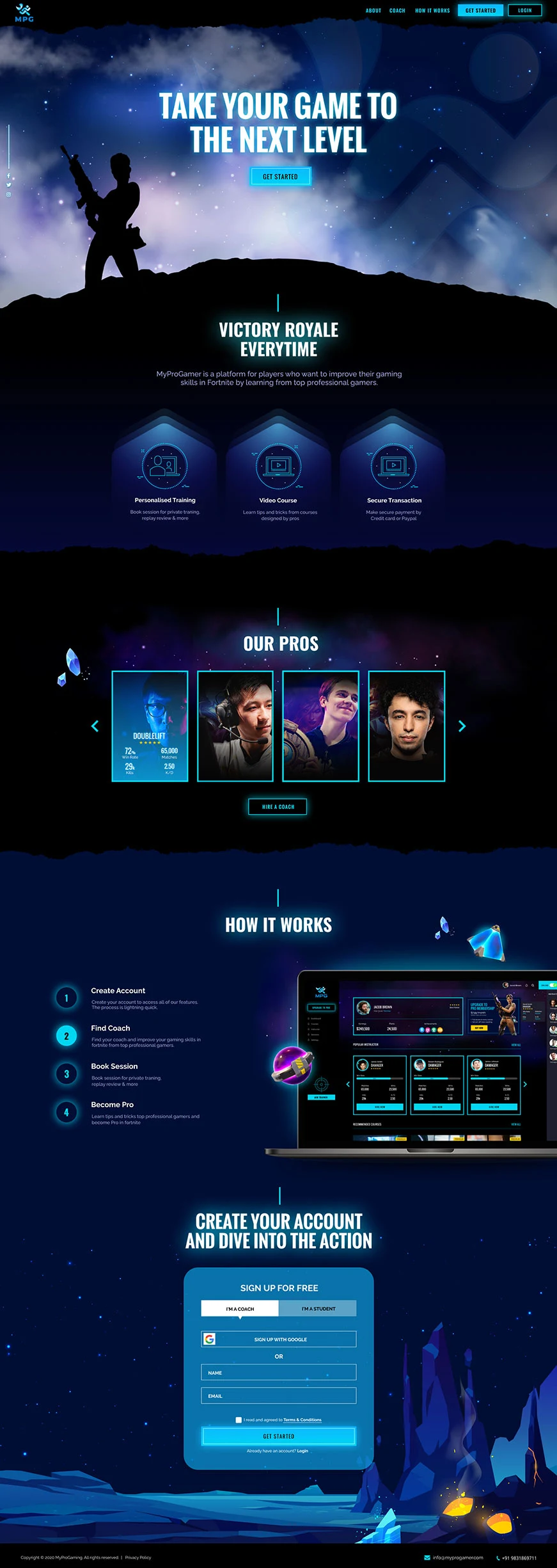
Website Design

Backend Design
